Expandable Components
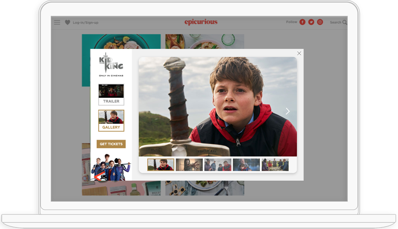
Expandable Contobox Local units are built using 3 components:
- Main Creative Area
- This is where we display all major interactive features that consumers can interact with.
- Feature Sub-menu
- This section lets consumers see all available features within your unit, and provides simple navigation to those features.
- Product Menu
- This menu allows users to interact with various products or services offered by your brand, and helps them find the features available for each.
For more information on how to design engaging expandable units follow our Engagement Best Practices
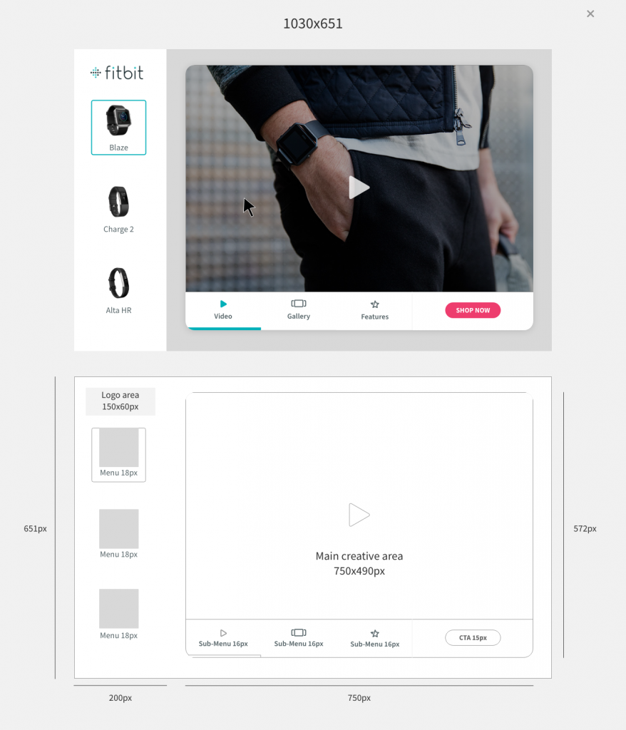
Key Specs
- Unit size: 1030x651px
- Main Creative area: 750x490px
- Feature Sub-menu: 200x490px
- Product Menu: 200x651px (Logo size: 113.4x29px)
Non-Expandable Components
Non-expandable units are comprised of the same 3 core components and 4 features as expandable units.
Specs change depending on the display unit size.
Non-Expandable Key Specs
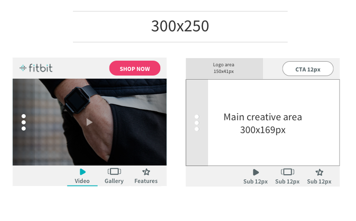
- Unit size: 300x250px (Same specs for mobile)
- Main Creative area: 300x169px
- Feature Sub-menu: 183x120px
- Product Menu: 95x183px (Logo Area: 150x41px)
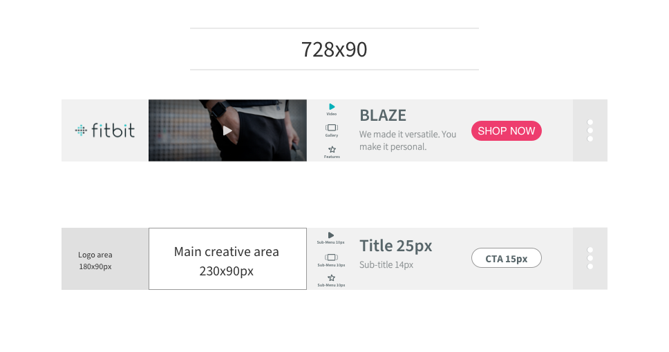
- Unit size: 728x90px
- Main Creative area: 230x90px
- Feature Sub-menu: 66x95px
- Product Menu: 728x90px (Logo Area: 180x90px)
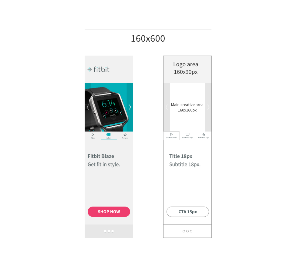
- Unit size: 160x600px
- Main Creative area: 160x160apx
- Feature Sub-menu: 160x30px
- Product Menu: 160x600px (Logo Area: 160x90px)
